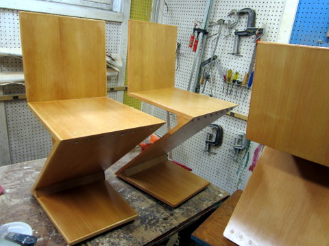
Phew – the polyurethane was drying on my last Zigzag chair while I wrote this post. It’s been a fascinating process, and I’ve learned a lot. Some questions got answered: the chair does not collapse under you when you sit on it, as numerous testers have confirmed, although it does bounce in a way that can be disconcerting if you are expecting it to give way at any moment. I still wondered how the idea for this form arose, and why it had to wait until the Twentieth Century.
My initial thought was that something about the need for bolts to sustain the chair’s joints made it difficult to achieve in older times. However. screws are ancient, were used in furniture production as early as the fifteenth century, and began to be mass produced in the nineteenth century in much the same form as they are today (see http://cool.conservation-us.org/coolaic/sg/wag/Am_Wood_Screws.pdf). Nuts and bolts developed along similar lines, driven by the carriage industry, and widely used in furniture, especially beds, as early as the eighteenth century (when they were hand-forged). In fact nothing obvious about the construction of the chair itself would have made it impossible to achieve in an earlier time. However it certainly would have been more difficult. Highly-precise joinery that is more or less routine today and achievable by workers with a modicum of experience using power tools would have presented a daunting challenge to the master craftsmen of the past working only with hand tools.
The Zigzag exemplified the sleek design aesthetic of the machine age (in particular the De Stijl movement) with its minimal form, simple materials and lack of ornamentation. In previous generations, one could have achieved something similar, but there was simply no reason too: one imagines the idea would have been rejected as a bizarre freakish malformed thing. Acutely angled weight-bearing joints would have been difficult to achieve without machine tools; there was no call for them; they were simply not a part of the design vocabulary.
The chair is the most humane piece of furniture. Its job is to support our bodies, but in its simplest form a chair is a rigid unchanging object, while we remain free to fold and unfold, and we come in many sizes and shapes. Every chair embodies a series of compromises: the height of the seat, the angle of the back, the flexibility of the materials. These, and even carven ornamentations and surface finishes, influence the fitness of a chair for a certain person or activity. The demands placed on a chair by their very nature fuse its appearance and its function into a single inseparable shape, which is why a designer’s chairs often exemplify their aesthetic more than any other work.
I find the Zigzag attractively arresting, and I think it will make excellent chair for working at a desk and for dining, if not for napping. My only regret is not to have made at least a few of them higher, since I like to work at a high drafting chair. A slightly odd feature of the chair that takes some getting used to is its tendency to flex *forwards*, but as my father says, nobody has been pitched across the table yet.
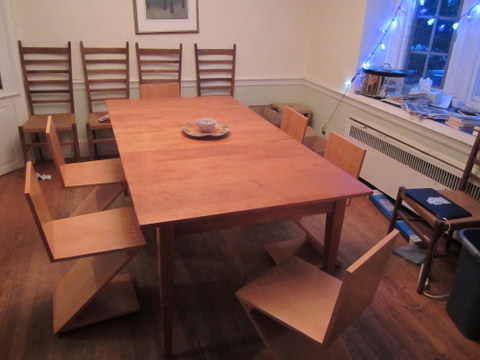
OK I finished the chairs before I finished the blog post; here you see them installed in my dining room.
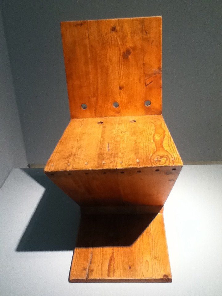
”For comparison, here are some photos of an example from Rietveld’s studio produced in 1938:
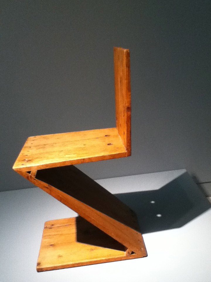
1938 example from Rietveld’s studio, from the collection of the Carnegie-Mellon Museum of Art, photo: Lauren Hammer
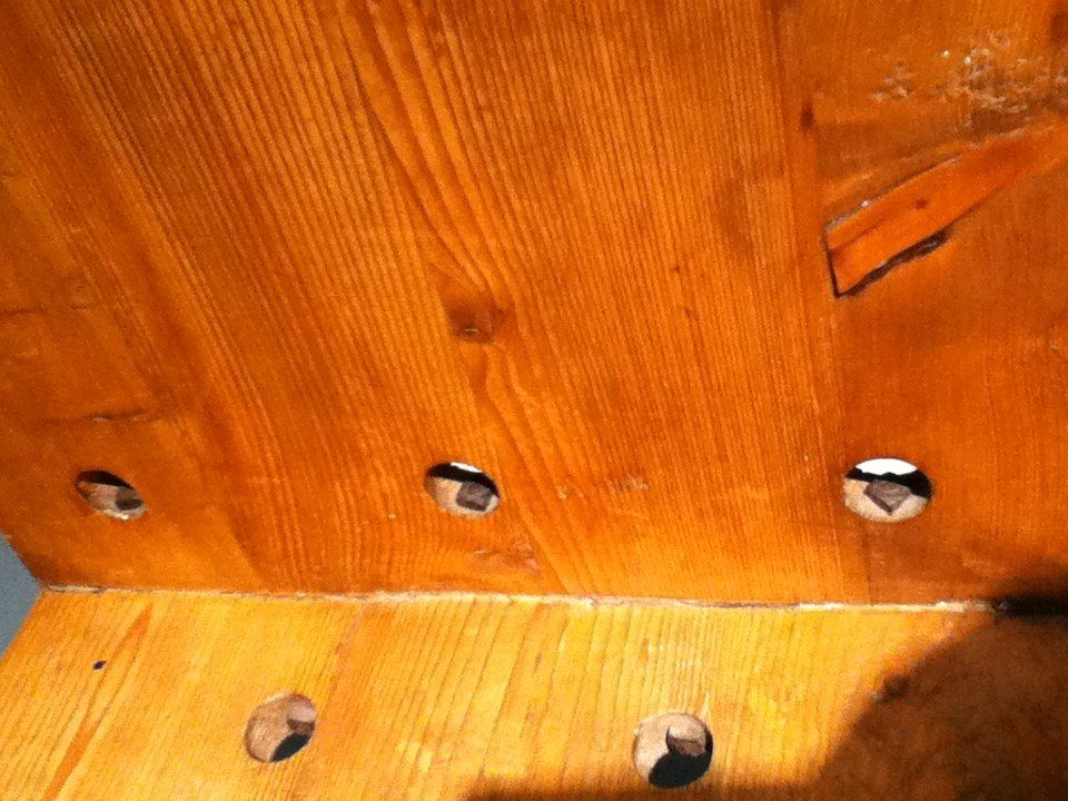
Note the bolt-holes in the seat/back joint. I didn’t find it necessary to bolt this joint since the dovetails seem to be strong enough. On the other hand it took me many weekends over the course of four months to make eight chairs.
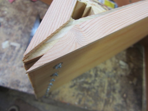
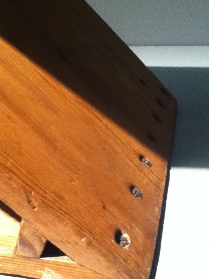
Also note that the screws are simply exposed
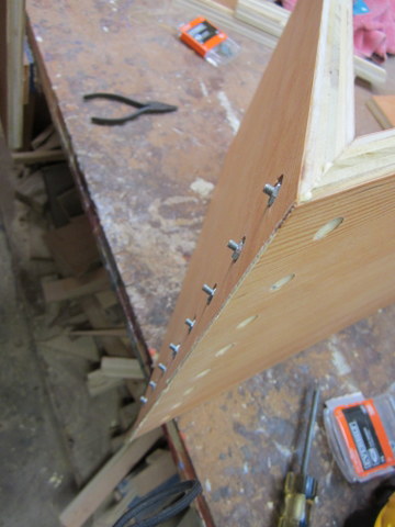
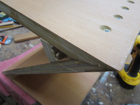
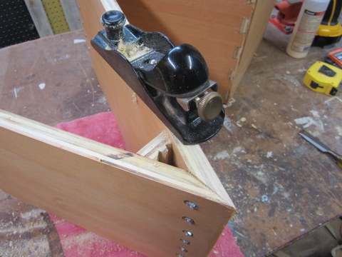
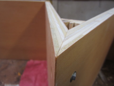
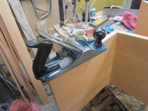
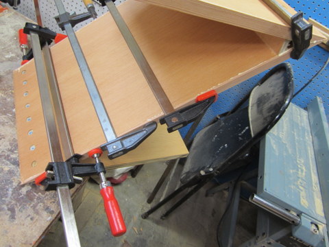
And some outtakes from the production. I ended up spending an inordinate amount of time finishing off the plywood edges, which is thr process being depicted below. Every chair required 8 pieces of trim that had to be fitted and glued. Because I made these from a standard 3/4-inch fir plank, the thickness matched the plywood’s exactly. Unfortunately this meant a very small tolerance for error during the gluing-up, and when it went wrong, the risk of sanding through the very thin plywood veneer was exacerbated. It would save a lot of time and effort to use solid wood. Still, the nicely-veneered fine-grained plywood surface is attractive and to my eye, enhances the modernist feel. Still, blue paint might be a nice way to go too!

